Oakton rolls out new website redesign
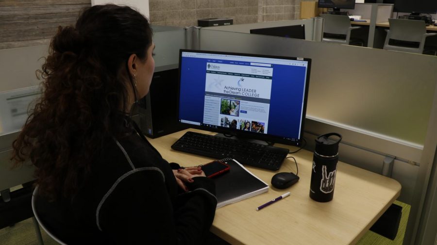
Students check out information on Oakton’s website, going through a redesign,
March 7, 2020
Oakton has a website redesign in the works. The classic ocean blue and forest green theme has been the staple of Oakton’s website for almost ten years. Chief Advancement Officer Katherine Sawyer explained, “We haven’t updated our website in about a decade. We’ve done a modest update for mobility, but we haven’t done a whole framework refresh.”
Generally, students find the current website useful. “I think it’s fairly easy to navigate. I haven’t explored every corner of it. I wish school hours were more visible, but I think it’s a pretty decent website,” said student Cole Cloud.
However, other students find the website to be far from perfect. Sometimes the website itself can be a little outdated and cumbersome to click around on. “Sometimes it’s a little confusing at times, but I’m pretty fifty fifty on it,” student Brett Briske said.
The site is critical for efficiency because it is used by prospective students as well as the general community. “It’s really our virtual campus. It’s the one space where Oakton is present 24/7 globally, which is why it’s so incredibly important to us,” emphasized Sawyer.
According to students, the theme of the website does a good job of representing Oakton by repeating the college’s general colors. Rodrigo García Bautista explained, “It’s exactly like the website because if you go to the new student portal and new applications it’s like going into the new areas of the building but when you start going into older parts you start seeing the parts that weren’t renovated or what not. It’s the same thing with the website.”
Cloud also continued, “I feel like the theme of the website matches the college. I’m looking around the cafeteria and I can see the same greens and browns, so the website does a pretty good job of representing the school when you’re in the building.”
In its present state, the website is available on both online and mobile applications. The current site has over 5,000 pages of content, while a typical site will have anywhere between 1,000 and 1,500 pages, which means a redesign will be a huge undertaking. “The website redesign is really a partnership between marketing and IT (Information Technology). It is both art and science that makes magic happen for the college,” Sawyer explained.
According to Sawyer, the goal of the redesign is to establish the Oakton experience online.
“The goals should be to make the website engaging, it should share our brand: the Oakton experience. What do you experience when you come here to campus?” she explained. The visual and user experience will play a huge role in how a potential or current student will perceive Oakton. “Our target market is prospective students and attracting them to Oakton to show what we can do for them.”
Making the site easier to navigate and streamlined is no easy task. Not to mention, Oakton has to cut its content down from 5000 pages of information to around 1500 pages. Due to this overhaul, Oakton has searched for help from consulting services to improve the website through developing analytics about the current user base.
“There’s a lot of room for improvement: to make it more searchable, to making things easier to find and fewer clicks, and to streamline the information,” Sawyer said. “We hired a firm initially to help us with an audit of the website: to look at how our website is performing today, what kind of traffic we’re getting, how long do people stay when they come, and are they trafficking around?
Rome wasn’t built in a day, and neither are websites. Oakton has been in the process of a redesign for a year, yet this is requiring a significant amount of time because a redesign is a long and arduous process that involves re-evaluating content while maintaining the current site with periodic updates.
“It does take time. We started this project about a year ago, and the first thing we did was start an advisory committee. The committee was a cross section of people from across campus to provide input on our current site and on what is and isn’t working for us,” said Sawyer. “We did this enormous audit, that taught us about and ultimately established wireframes, a sense of what the website would structurally look like. And now we just hired a firm last February to help us implement all of that.”
Furthermore, Oakton is focusing on ensuring that the new website has a number of multimedia sources to enhance the online experience.
“Now it’s all about content, and content is the visual, the photo, the videos, the worlds, and they have to be streamlined and powerful and informative for a great user experience,” said Sawyer.
As one could have guessed, current students won’t be able to see the redesign for quite some while. “Sooner than later would be great, but it will take some time. We anticipate that we probably won’t be able to go live for at least 12-14 months,” concluded Sawyer.
The process has begun, but students can be assured that a new redesign is certainly on its way.